import { useState } from "react";
import styles from "./Breadcrumb.module.css";
import styled from "styled-components";

...
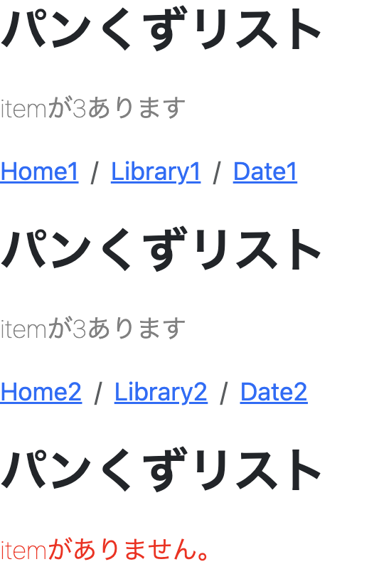
itemがありません。
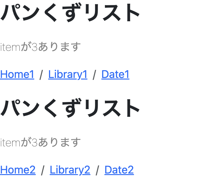
`と`itemが{items.length}あります
`にCSSを当てたいとします。その場合`` styled.p`当てたいCSS` ``のようにして、CSSを当てたpタグを作成することができます。記述する場所に関してですが、コンポーネントの外側に記述するようにしましょう。以下にて`NoticeParagraph`というCSSを当てたpタグを生成することができました。...
type Props = {
items: string[];
};
const NoticeParagraph = styled.p`
font-weight: 100;
color: gray;
`;
...
...
      {items.length === 0 ? (
        <NoticeParagraph>itemがありません。</NoticeParagraph>
      ) : (
        <NoticeParagraph>itemが{items.length}あります</NoticeParagraph>
      )}
...
...

type NoticeParagraphProps = {
  isBlank: boolean;
};

const NoticeParagraph = styled.p`
  font-weight: 100;
  color: gray;
`;
...
...

type NoticeParagraphProps = {
  isBlank: boolean;
};

const NoticeParagraph = styled.p<NoticeParagraphProps>`
  font-weight: 100;
  color: ${(props) => (props.isBlank ? "red" : "gray")};
`;
...
...
      {items.length === 0 ? (
        <NoticeParagraph isBlank>itemがありません。</NoticeParagraph>
      ) : (
        <NoticeParagraph isBlank={false}>
          itemが{items.length}あります
        </NoticeParagraph>
      )}
...
...
      <Breadcrumb items={items2} />
      <Breadcrumb items={[]} />
      <UserDetail />
...